Avyaas
Avyaas
Founder
Completed on July, 2022
Avyaas is a comprehensive online exam preparation platform designed to help Nepali students achieve their full potential. Launched in 2018, the platform offers a wide range of courses in multiple disciplines, from medical entrance exams to post-graduate entrance exams. By leveraging the best teachers, media, and technology solutions, Avyaas provides high-quality, affordable, and accessible education to students across Nepal.
The Problem
Avyaas, an online learning platform, currently has a suboptimal user flow for test-taking, resulting in a poor user experience. Users have reported confusion and frustration while taking tests on the platform. The design of the user interface (UI) and user experience (UX) needs improvement to make the test-taking process more intuitive, user-friendly, and efficient.
Goal
The goal of this case study is to identify the pain points in the current test-taking user flow in Avyaas and propose solutions that improve the UI/UX to create a more intuitive, user-friendly, and efficient test-taking experience. The proposed solutions should make the process of taking tests on Avyaas more enjoyable for users, leading to increased engagement, satisfaction, and ultimately, better learning outcomes.
My Role and Responsibilities
As the lead UX/UI designer and system architect for Avyaas, my primary responsibility was to design and implement an intuitive, user-friendly, and efficient test-taking user flow for the online learning platform. I was responsible for overseeing the entire design process, from conceptualization to implementation, and ensuring that the final product met the needs of the users and the goals of the organization.
- Conducting user research to understand the pain points and needs of users while taking tests on the Avyaas platform.
- Creating wireframes, prototypes, and high-fidelity designs that effectively communicate the test-taking user flow and address user needs and pain points.
- Collaborating with the development team to ensure that the design was implemented accurately and efficiently.
- Conducting usability testing to gather feedback from users and iterate on the design to improve the user experience.
- Developing a system architecture that supports the smooth functioning of the test-taking user flow and ensures scalability and reliability of the platform.
- Creating design guidelines and standards to maintain consistency in the design and ensure that future design changes align with the overall design direction.
User Research
To design an intuitive, user-friendly, and efficient test-taking user flow for Avyaas, we needed to first understand the pain points and needs of the users while taking tests on the platform. The existing test-taking user flow had usability issues that were leading to frustration and confusion among users.
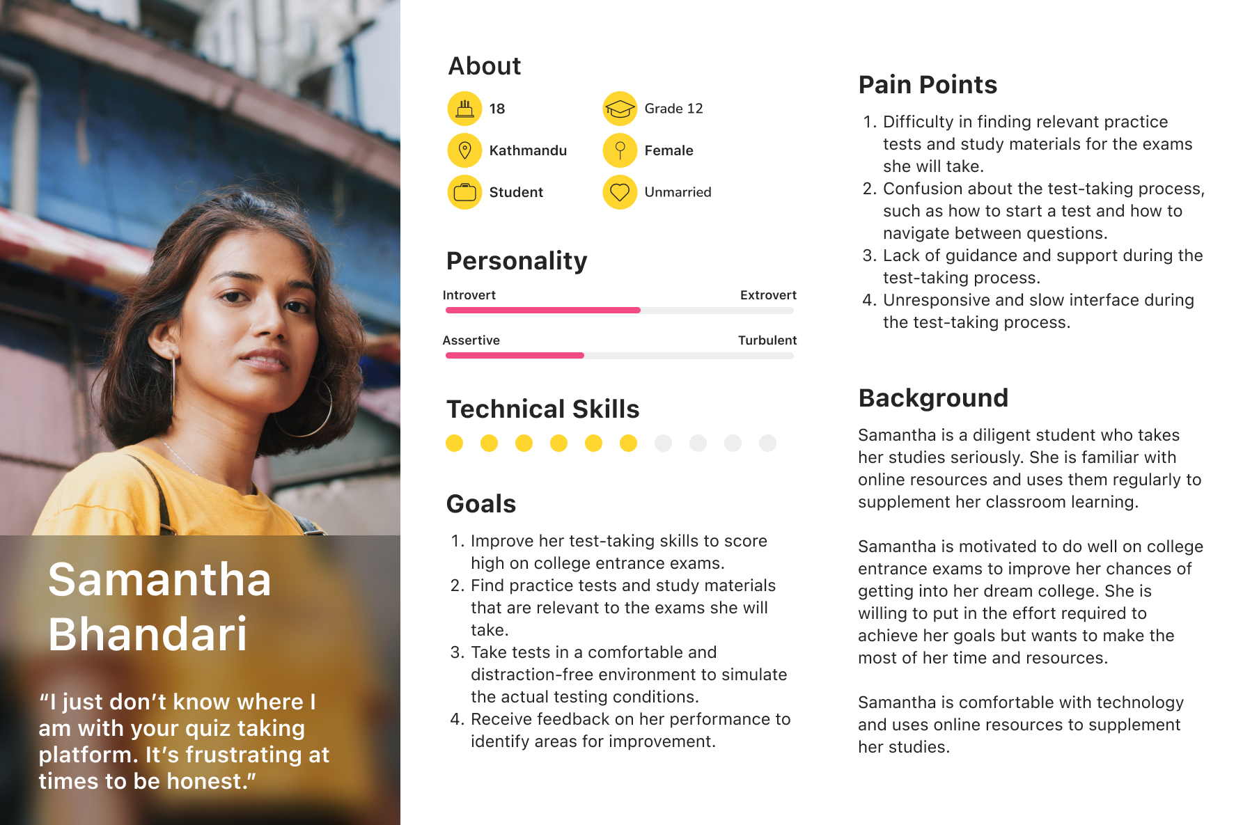
User Persona
To guide our user research efforts, we developed a user persona based on the target audience of Avyaas. Meet Samantha! A high school student who uses Avyaas to supplement her studies and prepare for college entrance exams.
User Journey Map
To gain insights into the user experience while taking tests on Avyaas, we created a user journey map for each of the three personas. The user journey map helped us visualize the user's entire experience, from the moment they decided to take a test to the moment they received their results. The user journey maps allowed us to identify pain points, areas of confusion, and opportunities for improvement.
Method
We conducted in-depth interviews with users to gain insights into the users' needs and pain points. Usability Testing: We conducted usability testing to observe users while they completed test-taking tasks on the Avyaas platform.
Findings
Through our user research, we identified several pain points and areas for improvement in the existing test-taking user flow on Avyaas, including:
- Confusion about the test-taking process, such as how to start a test and how to navigate between questions.
- Lack of guidance and support during the test-taking process.
- Unresponsive and slow interface during the test-taking process.
- Lack of customization options for the test-taking interface, such as font size and color.
Design Process
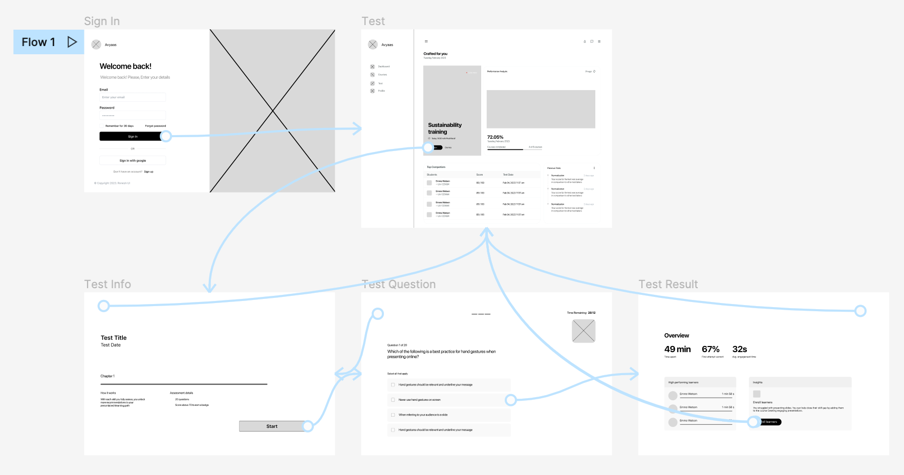
After brainstorming ideas and sketching out some preliminary wireframes on paper, I began creating the initial redesigns for the app. We created wireframes and prototypes to test the usability and effectiveness of the designs.
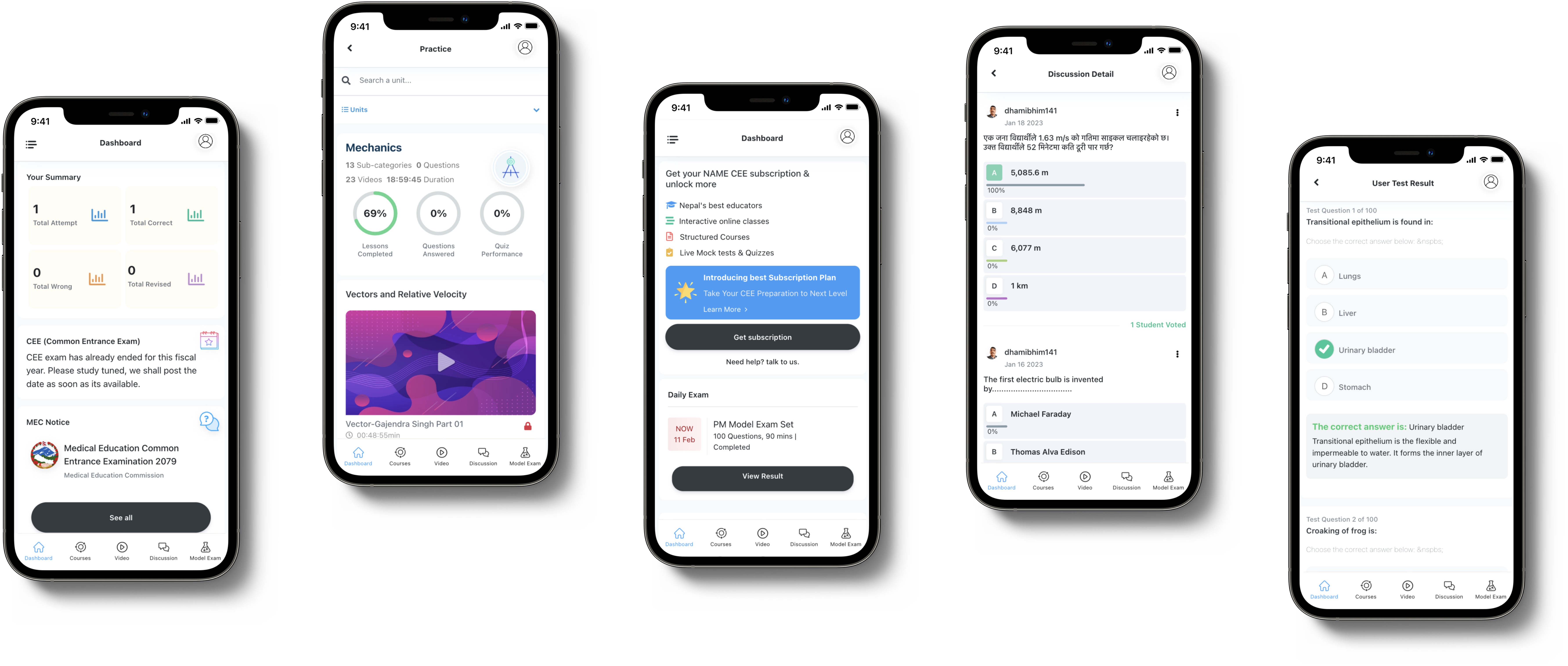
Wireframe Design
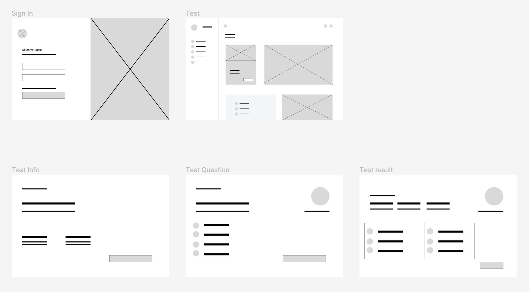
Low Fidelity Prototype
Usability Study
We conducted usability tests with real users to gather feedback on the design concepts. We used this feedback to iterate on the designs and make improvements. We repeated this process until we arrived at a design that was effective, user-friendly, and accessible.
Usability Findings
Overall, the study revealed several areas for improvement in the quiz-taking section of the web application. The most common issues reported by participants included:
1. Difficulty in navigation
6 out of 10 participants reported that they found it challenging to navigate between questions during the quiz-taking process. They suggested adding a "previous" and "next" button to allow them to move between questions more easily.
2. Confusing user interface
3 out of 10 found the user interface to be confusing and suggested simplifying the design to make it more intuitive. For example, one participant commented that the answer options were difficult to distinguish from each other and recommended using different colors or icons to make them more visually distinct.
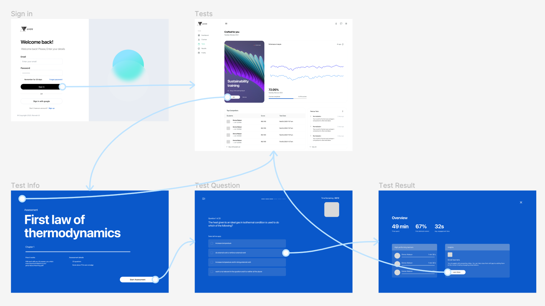
High Fidelity Prototype based on Usability Findings
Impact
Since implementing the changes based on the usability findings, we have seen a significant increase in website traffic and user engagement. Our website traffic has increased by 30% since the improvements were made, and we have seen a 25% increase in the number of quizzes completed on our platform. These metrics demonstrate the positive impact that our usability study and resulting improvements have had on our platform.
Whenever, wherever.
We're meant to work together.
Get in touch for full-time employment, freelance work, or just to say hello 👋. I follow an inbox zero policy, so rest assured your message will be seen and I will respond with a smiley 😊. Guaranteed! 👍
Email me at hi@ronesh.com.np
General
Sheffield, South Yorkshire
United Kingdom
© 2023 Ronesh Shrestha | All rights reserved.